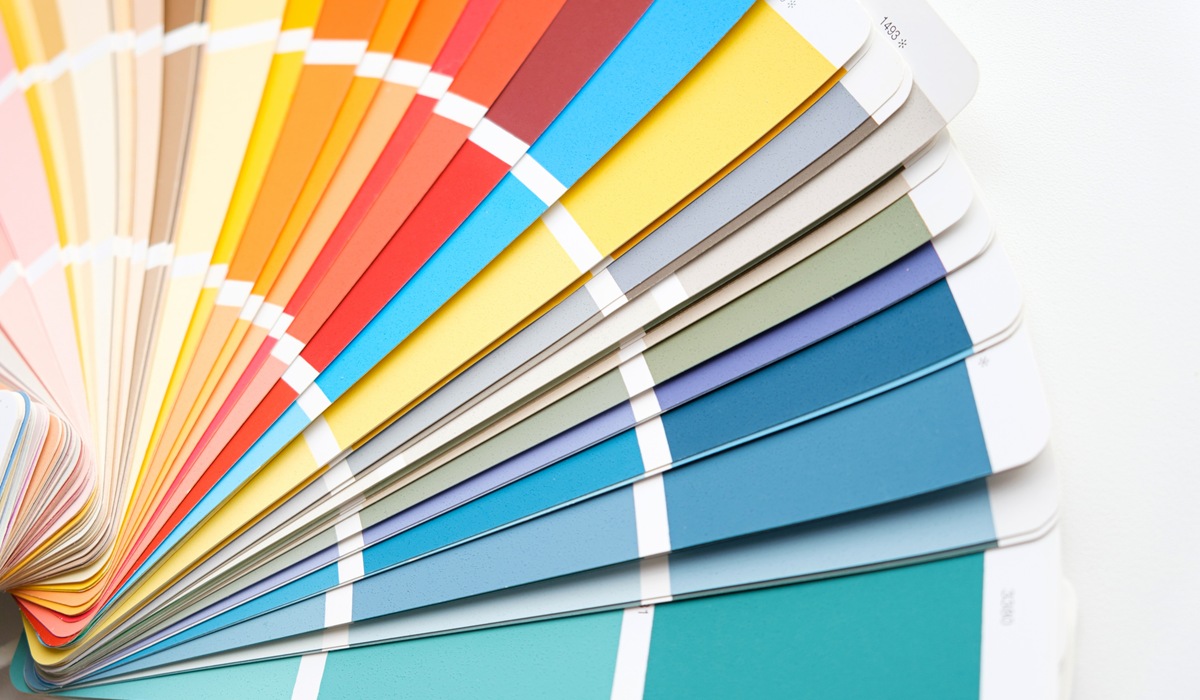
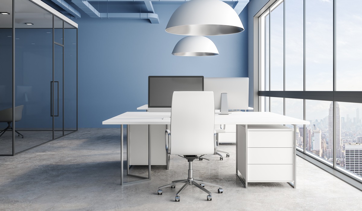
When you start an interior commercial painting project, you might not immediately think about how the paint color affects your team’s focus and energy. But here’s the truth: color psychology in the workplace plays a huge role in employee productivity, mood, and even company culture. A fresh coat of paint isn’t just about aesthetics – it can be a strategic tool for better performance.
Key Takeaways:
- Color affects mood, focus, and productivity.
- Strategic color choices can support your business goals.
- Different areas of your office may benefit from different colors.

How Color Shapes Productivity
Your office walls are more than just a backdrop. They set the tone for the entire workday, subtly influencing mood, motivation, and team dynamics. Studies in color psychology show that certain hues can calm anxious minds, spark innovative ideas, or sharpen focus on detailed tasks.
When every edge counts in a competitive business world, choosing the right colors can be more than decoration—it can be a strategic advantage.
The Science Behind Color Psychology in the Workplace
Our brains respond to colors on a psychological and even physiological level. For example:
- Blue: Often associated with calm, focus, and trust. Ideal for meeting rooms and analytical workspaces where clear thinking and steady concentration are essential. This shade can help reduce anxiety before important meetings or presentations.
- Green: Promotes balance and reduces eye strain, making it perfect for open work areas where employees spend long hours at their desks. It’s also known to create a sense of stability and harmony within teams.
- Yellow: Stimulates creativity and optimism, which is why it shines in brainstorming rooms or creative studios. Yellow can energize a space, encourage positive thinking, and inspire new ideas.
- Red: Increases energy and passion, but can also raise stress levels if overused. Best for spaces needing short bursts of activity, such as collaborative corners or sales floors where quick decision-making and enthusiasm are key.
The right balance of colors can help create a workspace that fosters both well-being and high performance.
Choosing the Right Colors for Your Office
When planning an interior commercial painting project, consider the function of each space:
- Focus Zones: Use calming tones like soft blues or greens to help employees concentrate for extended periods without feeling mentally fatigued. These shades can reduce stress and create a steady, focused atmosphere.
- Creative Areas: Pick energizing shades like yellow or orange to spark imagination and innovative thinking. These bright hues can uplift moods and inspire fresh perspectives during brainstorming sessions.
- Break Rooms: Choose warm, inviting colors that encourage relaxation, such as soft beige, warm peach, or muted coral. A comfortable palette helps employees recharge during downtime.
- Collaboration Spaces: Blend stimulating and calming tones for balanced interaction. This mix can keep conversations lively yet constructive, supporting teamwork without overwhelming the senses.
Remember, lighting and furniture colors also influence how paint colors look and feel.
How Color Affects Employee Performance
Research suggests that the colors around us impact concentration, accuracy, and creativity:
- Blue and Green: Linked to better accuracy and sustained focus, these calming shades help employees maintain concentration over long periods while reducing fatigue. They can be especially effective in work environments that demand meticulous attention and steady performance.
- Yellow: Sparks innovative thinking by stimulating the brain’s creative centers. This bright, cheerful color can help teams generate fresh ideas and approach problems from new angles, making it ideal for design or marketing spaces.
- Red: Can heighten attention to detail in short bursts, providing an energizing boost for tasks that require urgency or precision. However, it’s best used sparingly to avoid overstimulation.
By understanding color psychology in the workplace, business owners can make intentional choices that align with their productivity goals.

Common Mistakes to Avoid
Before you choose your final color palette, it’s worth knowing the common pitfalls that can undermine even the best intentions. Here are a few to watch out for:
- Overusing intense colors: Too much bright red or yellow can be distracting and even cause fatigue over time. These colors are best used sparingly as accents rather than dominant wall shades.
- Ignoring natural light: Colors look different under various lighting conditions. A hue that feels calm in daylight might look harsh under fluorescent bulbs, so test swatches at different times of day.
- Skipping employee input: Involving your team in color selection can increase engagement and buy-in. When employees feel heard, they’re more likely to embrace the new environment positively.
Making the Change
If your office feels uninspired, a strategic paint update can transform it. A professional painting contractor experienced in interior commercial painting projects can help you choose colors that reflect your brand and boost your team’s performance.
Bring new energy to your workplace. Contact Rojas Painting today at 707-353-7471 to schedule a color consultation and start your transformation. The right colors can inspire focus, creativity, and productivity every single day.


